Many of us treat hospitals with suspicion and fear. The room for medical procedures, which smells of medicines, makes us feel uneasy. But it doesn’t have to be this way!
In this article, we will tell you how we have redesigned a network of premium medical clinics: what business goals had to be achieved, how we used design and dynamic illustrations to talk about new service, why we started with copywriting, and what has changed in the interface. You’ll find out how you could adopt a similar approach for your business if your website is outdated.
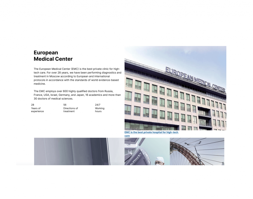
Intro: : the European Medical Center (EMC), JSC, is a large private medical company. The EMC employs more than 600 doctors from Western Europe, the United States, Israel, etc. Up to 90,000 patients are treated there each year. The EMC works in all medical fields, offering patients tailored, comprehensive health care and innovative diagnostic and treatment methods.
Redesign in numbers
Our project development team: 24 specialists.
Site visitors per month: 1,084,360.
The EMC customers: 20%.
The old website did a good job in terms of SEO marketing tasks: there were a lot of articles on medical topics, which attracted traffic and increased the semantic kernel. However, the user experience has changed dramatically over the past five years, and today SEO alone is not enough. We wanted to demonstrate that the EMC has many years of expertise, and with modern tools, the clinic can redirect the client to where they will get a qualified answer or make an appointment with the right specialist. To put it simply, take the targeted action here and now.

In late 2019, the EMC focused on a new "360° health" approach. Its goal is to form an individual roadmap for each client, becoming a lifelong medical advisor on the path to longevity, helping patients every step of the way to a long, comfortable, and active life. Adapting the old site for the new positioning was not possible as it was outdated, both technologically and structurally. There was another problem – the design was more appropriate for a government institution than for a private clinic.
The four main tasks are:
- To create an online platform representing a premium multi-platform digital hospital, completely redesigning the structure of the site, and creating communication with the user.
- To focus visitors’ attention on the new "360° health" paradigm.
- To prepare the site for changes in business processes and adding new tools allowing more targeted actions.
- To keep the SEO position in the search results after the launch of the renewed site.
1. Researching and analyzing
First, we conducted a pre-project survey, talked to the top managers of the clinic, and identified four major problems in the interfaces, which hampered the use of the old site to the maximum and did not reflect the luxury positioning:
- The site is outdated, both technologically and structurally.
- It's design reminds clients of a government institution.
- The website content resembles an encyclopedia. There is a lot of text and when you look at the site you don't realize that it is a premium clinic with advanced technology and competencies
- Everything is jumbled together: news, publications. The content is duplicated in different sections. It was confusing for the users.
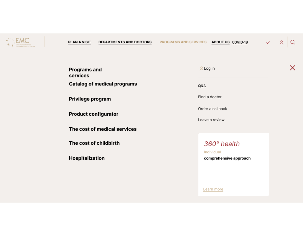
2. Designing «360° health»
We used two different approaches to create the site, and both were successful:
1. For the homepage, we used text as a guide for the design. First, we got copywriters and editors on board, and then we made a prototype.
2. The rest of the pages were first designed based on the customer's requirements, and then text was added to them.
Either of these variants can be used to design a site. The first will be richer in content, and the second — a little more functional.
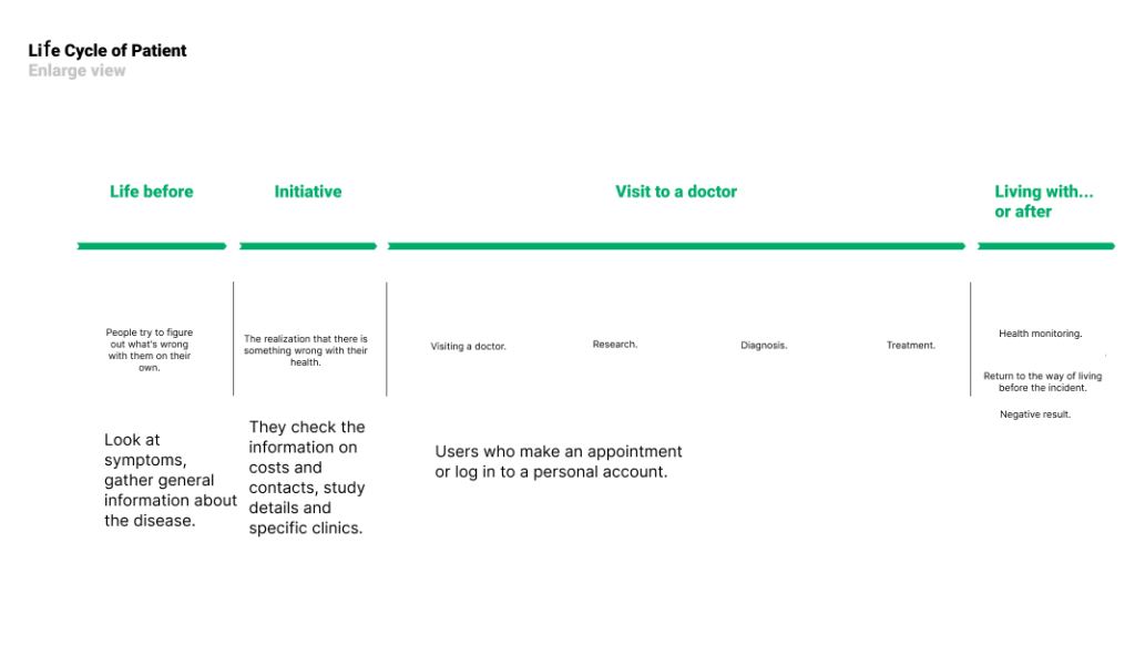
When creating a new structure of the site, we immersed ourselves in analytics and numbers. We evaluated the current site in terms of user traffic, determined the structure of new sections, checked it in basic scenarios, and tested it on users. The most popular sections were clinics, articles, the home page, and services. As we found out, the most common user scenario was to look at the symptoms of the disease, check the cost of treatment, and make an appointment with a specialist.
We tested hypotheses about the usefulness of the menu and checked how well the suggested sections meet users' needs, as well as what steps should be added to planning an appointment. All the items in the “Plan a Visit” menu section were rated on a scale of 1 to 5 by 40 respondents. The form for making an appointment with a doctor and the questionnaire for new patients were given the highest rating, while the accommodation for the check-up period and services for foreign patients were given the lowest one.

3. Developing a redesign of the medical center
Having finished with the functional part of the clinic's website, we moved on to UX/UI changes.
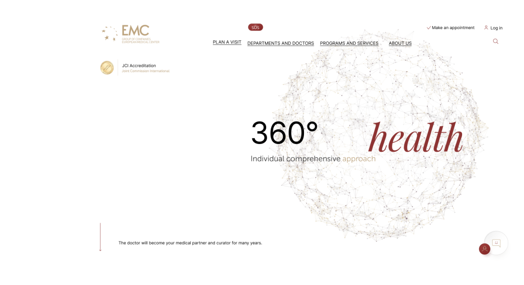
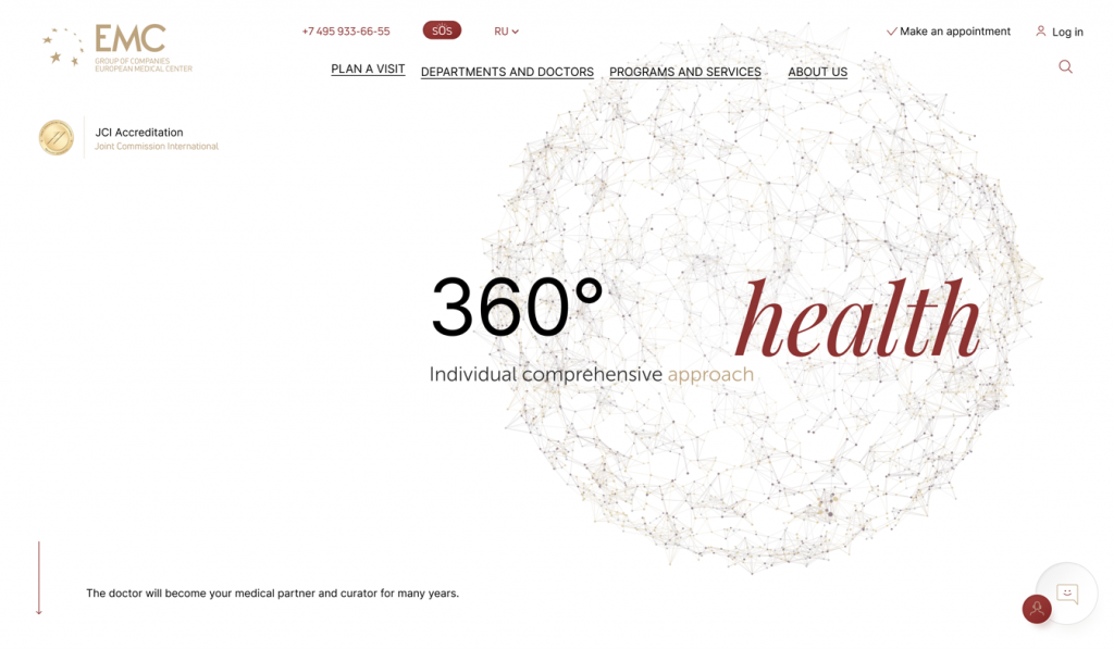
Home
Services allowing you to immediately find the right channel of communication with the clinic were placed on the main page. We carefully incorporated the story of the "360° health" concept. The interactive insert with a story draws users’ attention, but does not distract visitors who only need a particular service or want to make an appointment with a particular doctor.
The main task of the home page is to attract customers and to create a conversion action, which is to make an appointment with the right specialist, order a callback, download an app, go to the chat, or press the SOS button. According to the NPS, there are no negative factors in terms of visitors' unfavorable experiences with the site.
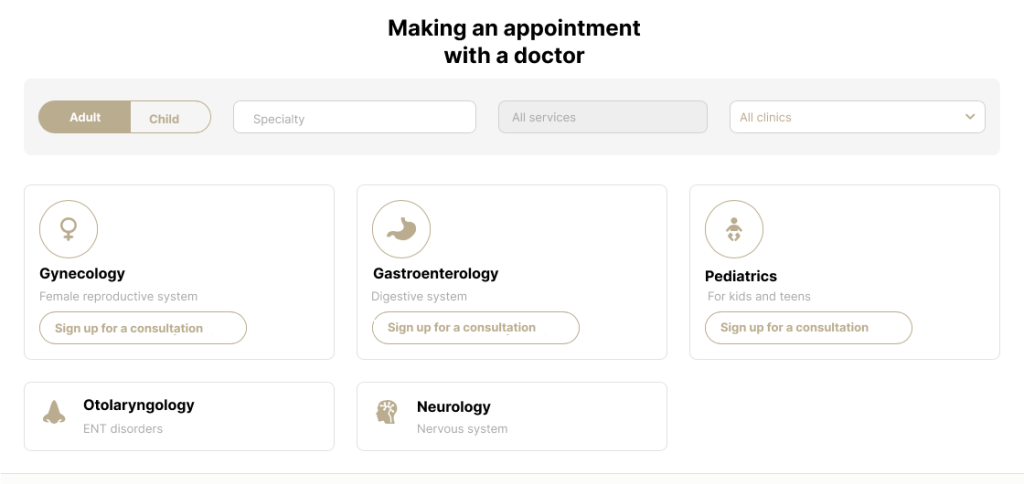
Selecting specialists
We restructured this section as well. Now there is a list of all the doctors working at the clinic. To choose a specialist, a visitor can use the search or a set of filters. We also added integration with the MIS (Medical Information System) allowing you to immediately select a date and time and create an appointment.
The information was poorly structured and difficult to read on some pages of the site. We added cross-references to the clinics where the specialist works. We also divided large chunks of information into subsections to quickly find the required specialist experience, reviews, articles, and videos related to the doctor's profile. We added pictures of doctors in the same style, and in total, our designers have processed more than 500 photos to combine them into one style.

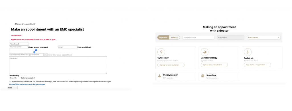
Making an appointment
The old site had only an application form, where clients described their symptoms and marked suitable dates for their visit. On the new site, we have a widget added directly to the appointment of a specialist, which means that now the client does not have to wait for an answer — they can immediately make an appointment at a convenient time. This took some load off the call center operators, who had to receive assignments, pick up available slots, and call the client back.
This allowed us not to increase the client communications center staff and to cover a larger number of tasks. There were 20% fewer calls, but the number of conversations in WhatsApp Business doubled. Basically, we managed to move customers from a voice to a non-voice channel of communication — 31% of them chose chats. An operator can have 3–5 conversations at a time in WhatsApp, which frees up the voice call center to work on more challenging customer tasks.
News
Articles are one of the most popular and important materials on the site. They emphasize the doctor's expertise and help a visitor choose the right specialist.
The old "News" section had articles, publications, and lots of other information. It was difficult for users to navigate through the materials, so we divided everything into subsections "News," "About us," "Specializations," and others.
We worked on the "News" together with the EMC SEO specialists. "Since we were transferring old materials to the new site and completely changing the structure of the section, it was important to take into account all the redirects of old publications. This helped painlessly continue the search engine promotion of expert content and get to the top of the search engine rankings.
Some numbers on information transfer:
- specialty cards — 285;
- doctors’ cards — 623;
- program cards — 56;
- service cards — 233;
- 442 article cards;
- disease cards — 287;
- news cards — 589;
- FAQ cards — 246.
New features
The EMC customers expecting a baby can set up the service for future births. Using a calculator, it's easy to see how extra options affect the final cost. As for the postpartum period, you can immediately add the necessary and customized services that new parents will need.
We clearly outlined the steps of a program registration on the new calculator — before it could hardly be called step-by-step. We also explained how the hospital rooms in the program differ from each other, presented the doctors, and the additional services that can be requested.

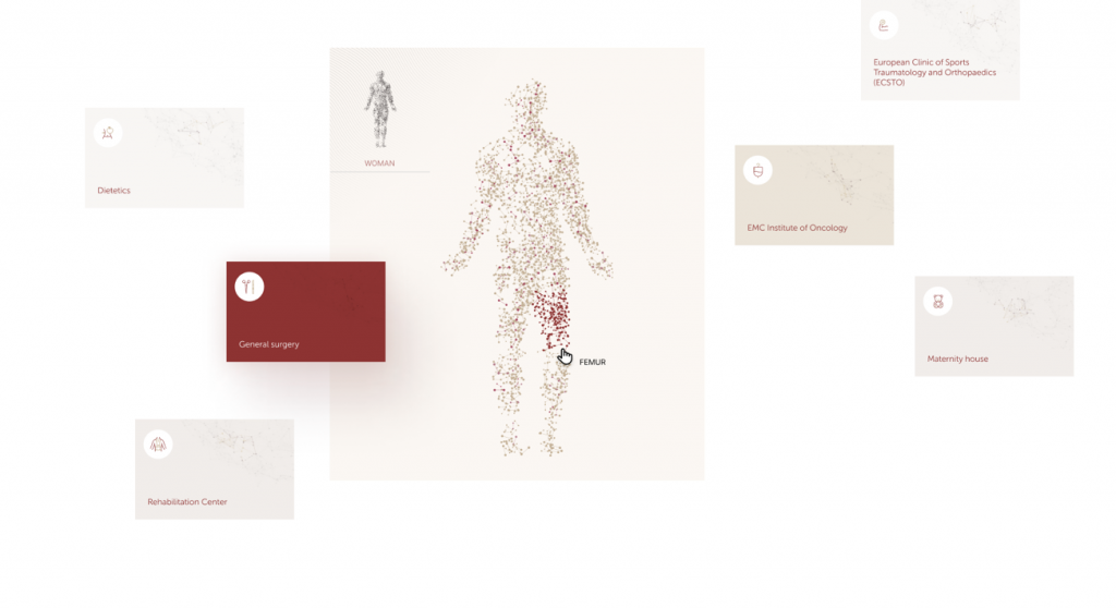
4. Drawing dynamic illustrations
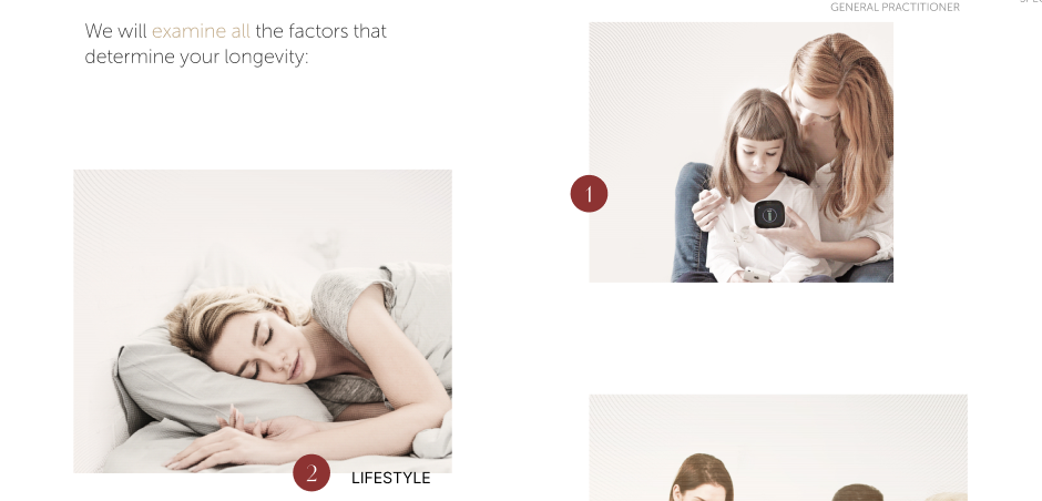
To fully explore the core of the new service, we made dynamic illustrations: a sphere and a dot man. The sphere demonstrates high-tech services and shows that in the clinic you can take comprehensive care of your health by 360°. The dynamic sphere is given a human shape in the form of the dot man, which represents the idea of connectedness. Everything in the human body is connected and influences each other.
Health is a complex mechanism with a large number of interacting systems and organs. The interactive sphere fully coincides with our vision of the customer experience, both online and offline, and the concept of client/patient relationship in general: everything that applies to any point of interaction between us and our customers. The sphere elements permeate the entire site and create a unified image, which we wanted to achieve.
Another graphic object of the new site was the main building of the EMC in the style of engraving. The animated 3D illustration complements the image of a premium clinic and reflects technology and modernity.
Results
Together with the EMC team, we transferred offline to online and created a full-fledged digital hospita, now all patients of the clinic can create a tool to monitor their health and the health of their loved ones on one platform. Now users can easily make an appointment with a doctor, calculate the cost of services, prepare for the birth of a child with a special calculator, and explore information about clinics without leaving home.
With IMAGA, we've managed to get all EMC's 30 years of expertise read off in 1–2 scrolls. The client can select the required target action in a couple of clicks and find all the necessary information. We have highlighted the main areas of our activity and introduced a new mission to the client — increasing longevity and quality of life, to help remain active for years to come — the EMC's primary role for the client as the main medical partner for life. Elements of animation and gaming highlight the modern approach and innovation that we are actively pursuing and promoting. Our website has become the brand ambassador for the promotion of all innovations from the EMC. Metrics also confirm positive changes, the depth and viewing time on the new site has doubled, and the number of rejections has decreased by 20%.
In 2021, the EMC clinics network won the Luxury Lifestyle Awards. It was officially recognized as Europe's best medical center in the premium segment.