Hello, I’m Lena Maerkina, CPO at IMAGA. Today, I would like to tell you how to make the life of sellers easier and make a product more user-friendly. As you can see, we will be talking about self-service analytics. Let’s get started!
In this article, we’ll focus on deploying the necessary infrastructure to implement client-side self-service analytics, systematize the work with big data, and make it easier. We will cover the techniques to make data processing simpler for all employees in your company.
If your business has a massive backend part with warehouses, logistics, shipping, turnover, and offline orders, we recommend reading this article thoroughly. This set-up of self-service analytics will also be helpful if:
- you need an end-to-end customer journey for the entire system,
- you have a lot of product teams working with data,
- you prefer product managers to be able to work with data on their own.
Task
We will describe a case we worked on for a company. We cannot disclose its name because of the NDA agreement. Let’s just say it’s a well-known brand, and working with metrics is important for its business. Our initial task was to strengthen the in-house data analytics expertise. The client was looking for teams who could promptly join the project.
IMAGA has been solving similar cases successfully for many years. We know how to select teams for a specific task, quickly integrate into the customer's processes, and get down to business right away.
In less than one week, we immersed ourselves in the project specifics, prioritized tasks together with the product teams, and got to work.
This project used Scrum methodology, which means there are short work cycles (sprints), the customer is constantly involved in the project, the backlog is created in collaboration. All this allows us to minimize errors in the final product and achieve results within a deadline.
How we were deploying self-service analytics
Our product analytics team consisted of two to nine people at different stages — analysts, a tester, an analytics team leader, and a manager. In the beginning, we brought in an analyst and a manager, we were collecting data (app + web) which we used to make reports for customers within the company.
At this stage, the project specifics became clear, allowing us to identify potential points of growth. Once it was agreed with the customer, we decided to develop product analytics via self-service.
Self-service analytics is a type of business analytics allowing specialists to query the right data and generate the necessary reports on their own without bringing in analysts.
The customer has a lot of data. Many business users rely on them to make decisions. Self-service analytics can help customers accelerate routine data processes and give analysts more time to solve complex strategic tasks.
As part of the task of deploying self-service analytics,
- We have created a metric hierarchy.
- We have deployed an ELT layer and implemented a BI tool for data visualization.
- We have developed a data catalog.
Metric hierarchy
There are five or six in-house teams working with the client’s mobile app, each responsible for a different section. These product teams manage the features, tracking, and analytics for their sections by themselves.
We interviewed each team and learned about their KPIs, metrics, and what data they collect. We found out that:
- the teams lack certain types of data, so some decisions are made at random,
- there is no understanding under end-to-end analytics, of how each team’s actions affect each other.
Based on the information collected, we decided to build a hierarchy of metrics.
The hierarchy of metrics is one of the methods for working with metrics; it has a tree-like structure with the key product metric (North Star metric) at the head of it.
We have two North Star metrics, turnover and MAU, and each team is responsible for them. To make the hierarchy:
- we have identified what types of data teams need to track before making decisions,
- we have arranged the indicators by importance and determined the dependencies between them,
- we have listed all of these metrics — from general to more specific.
In our case, the hierarchy of metrics within the product — the mobile app — is divided by subproducts: financial services, feedback, loyalty, delivery, etc. This allows us to evaluate how the metrics for each process affect the end goal.
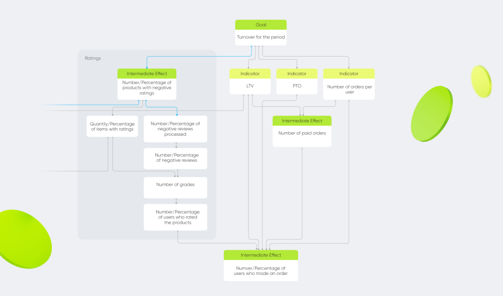
You may ask: why do we need all this? After all, you can collect data and prepare reports for the business without a hierarchy. Yes, of course, you can. But we believe the hierarchy of metrics to be a more thorough approach, which helps to organize the work with data strategically, rather than operationally. It is very important for any business, especially a large one, to see how metrics from the lower levels influence the upper levels, the most significant ones.
While working on the hierarchy, we also audited all the customer’s markup. We assessed what was done well and what was not. Prepared the ToR for updating the markup. All critical points were immediately corrected so that unnecessary events wouldn’t clog up the data.
ELT layer and Metabase
Self-service analytics is based on a user-friendly BI tool with basic analytical capabilities and data visualization. We chose Metabase, a free Open Source tool that has a low entry threshold for the user and carries out the following client tasks:
- it allows making dashboards using the standard method,
- the platform uses a wide range of self-service analytics tools.
This enables product managers to study the datasets and get the necessary metrics on their dashboards without the help of analysts.
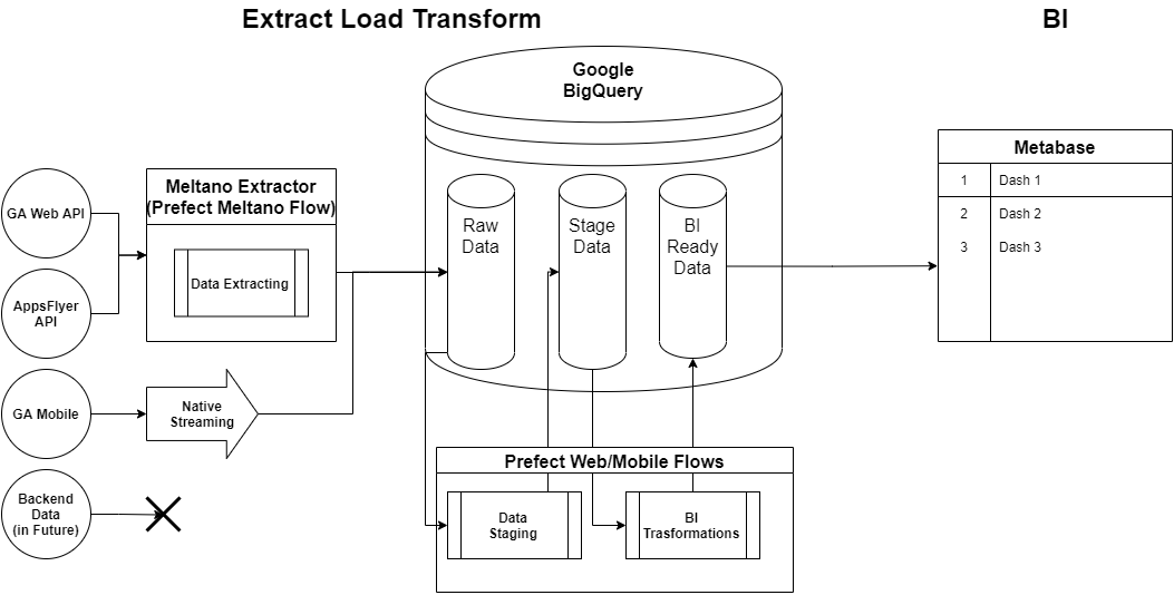
To get the BI tool up and running, we used every ELT tool.
ELT (stands for «extract, load, and transform») is a set of analytical tools that allow you to get data from different sources and immediately visualize them in a BI tool.
It should be noted that initially, all product teams worked directly with Google Analytics, because of that a lot of data was inaccurate, as there was sampling. To solve this issue, we need to create a single data warehouse (DWH). It allows business users to work with end-to-end analytics — linking actions from clicks to purchases, including offline. We convert data from Google Analytics into an analytical form using Meltano. Then, based on that data, we add an analytical layer with prepared cleaned-up data that implements the metrics that the product teams need.
The technology stack of the ELT layer looks like this:
Extractors offload data from Google Analytics UA (Web), AppsFlyer, and Firebase API. Loaders transfer data from these sources to BigQuery.
Loaders transfer data from these sources to BigQuery.
Transformers are configured through BigQuery and SQL queries. The data is organized into three layers:
- Raw data.
- BI data — the raw data is cleaned up and put into an analytical form.
- Data from the BI layer is monitored by the Metabase visualizer.
Metabase turns all collected data into charts, graphs, and dashboards. In total, we track almost 140 different metrics, such as:
- Total number of MAU (Monthly Active Users)/DAU (Daily Active Users) for the entire app.
- MAU/DAU of various sections.
- Android/iOS installations in a month.
"This is one of the biggest projects in terms of data, with 100,000 unique events alone, which is a lot. Using self-service analytics, we’ve simplified the work with this amount of data and tried to take the load off the analysts as well as speed up obtaining the necessary information for data customers. For example, using dashboards, we have minimized the number of ad-hoc requests (requests for downloads, reports). At the beginning of 2021, there were up to five requests a month, now there is one request every two or three weeks.

Now, with analysts reporting less frequently, we have the resources to work on strategic tasks:
- We are improving the quality of the data that goes into the tool.
- We are working on RnD tasks for analytics development. For example, searching for data that we don’t yet have, but we can get.
After the launch, we continue to maintain and develop the ELT layer, connecting more data and sources, and migrating more dashboards to Metabase.
Data catalog
We have already mentioned that the customer had a lot to attend to. Some of these events were getting out of date, and the reports using this data no longer reflected the real picture. It is impossible to test 100,000 events manually, so we have created a data catalog that determines the relevance status of each event.
For example, if an event is being logged, it remains unchanged in the mobile app — meaning that the event has the status of «Active» and there is nothing wrong with it. When we realize that the event logging pattern has changed, and we no longer receive it, its status changes to «Obsolete». Then we start the process of checking for outdated events, find the dashboards in which they are used, and figure out what to do with them: shut them down, update, or change the obsolete event to the active one.
The data catalog is meta-information, which can be combined with the backend data. We collected meta-information on all events and made descriptions for each one. Then this information goes into the information visualizer and becomes visual.
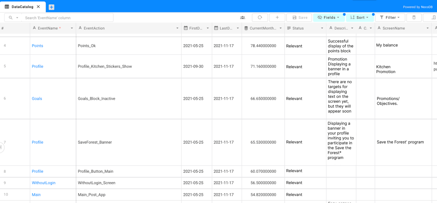
We used NocoDB, an open-source Nocode platform that allows you to turn any database into a spreadsheet, as a tool for the data catalog. We used it to update the manual data we needed to see in Metabase. You can also meta-label events, specify that part of them belongs to a certain business process, and make reports on this business process.
For example, there may be hundreds of events in the «User Registration» business process, and you need to recall and list these hundreds of events to prepare a report. But when you have a data catalog and information showing that these events relate to a business process, you can query everything that relates to that.
Now users do not have to waste time and energy searching for relevant data and changing the status of events (especially in large reports), as the necessary information is easy to obtain, read and understand.
Documentation
Once we have built a hierarchy of metrics and started working with the data based on it, we documented all the main parts. We:
- described the dashboards,
- explained how the ELT layer works,
- developed protocols for task assignment and team interaction.
We made a spreadsheet for all the metrics we used, indicating whether there is data for a particular metric, where it is, and how to calculate it. We implemented input tracking on those metrics where it was required.
Thanks to this, users can quickly familiarize themselves with the new rules and better organize their workflow.
Summary
It was an interesting experience for our company. We helped yet another company by creating simple-to-use self-service analytics software. We optimized and simplified the process of data collection and analysis, making it more accurate (hierarchy of metrics), visual (Metabase), and intuitive (data catalog).
By doing so, we reduced the workload of analysts for some tasks by more than 2 times and helped product managers to improve efficiency through a deeper study of data.